
A complete guide to theme.json in WordPress. Learn how to configure settings, define global styles, set up custom design tokens, and control the block editor with theme.json.
If you are building FSE themes or custom Gutenberg blocks in 2026, theme.json is the most important file in your project. It controls how the block editor behaves, what design options are available to content editors, and how global styles are applied across your entire site.
It is also one of the most under-documented parts of modern WordPress development. Most resources either skim the surface or go so deep into specific properties that they lose the bigger picture.
This guide covers everything you need to know to use theme.json confidently — from the basic file structure to settings, styles, custom design tokens, and block-level overrides.
What theme.json Actually Does
theme.json is a configuration file that lives in the root of your WordPress theme. It serves three distinct purposes:
It controls what the block editor exposes to content editors — which color options appear, whether font size controls are shown, which spacing units are available. Without theme.json, the block editor shows every possible option. With it, you decide exactly what your editors can and cannot touch.
It defines global design tokens — your color palette, typography scale, spacing values — that flow through to CSS custom properties automatically. Change a color in theme.json and it updates everywhere that color is used across the entire site.
It applies default styles to blocks — headings, paragraphs, buttons, images — without writing a single line of CSS. Everything goes through the same configuration file.
The File Structure
theme.json lives at the root of your theme directory alongside functions.php, style.css, and your template files.
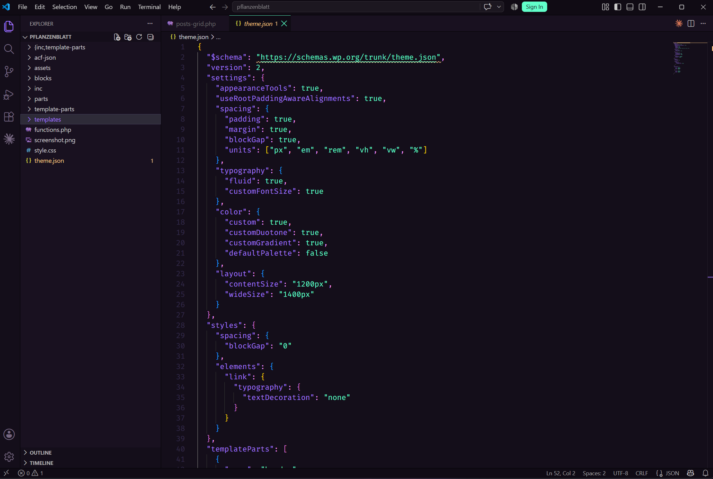
The top level structure looks like this:
{
  "$schema": "https://schemas.wp.org/trunk/theme.json",
  "version": 3,
  "settings": {},
  "styles": {},
  "templateParts": [],
  "customTemplates": []
}
The $schema line enables autocomplete and validation in VS Code — always include it. version should be 3 for themes targeting WordPress 6.6 and above. The four main sections are settings, styles, templateParts, and customTemplates.
Settings
The settings section controls what the block editor exposes to editors and what features are enabled globally.
Enabling Editor Features
"settings": {
  "appearanceTools": true,
  "useRootPaddingAwareAlignments": true
}
appearanceTools is a shorthand that enables border, color, spacing, and typography controls across all blocks in one line. It is the simplest way to unlock the full set of editor controls without enabling each feature individually.
useRootPaddingAwareAlignments enables full-width and wide-width alignments that respect the root padding values — essential for hero sections and full-bleed layouts.
Typography Settings
"settings": {
  "typography": {
    "fluid": true,
    "customFontSize": true,
    "fontSizes": [
      {
        "name": "Small",
        "slug": "small",
        "size": "0.875rem"
      },
      {
        "name": "Medium",
        "slug": "medium",
        "size": "1rem"
      },
      {
        "name": "Large",
        "slug": "large",
        "size": "1.25rem"
      },
      {
        "name": "X-Large",
        "slug": "x-large",
        "size": "1.5rem"
      },
      {
        "name": "Display",
        "slug": "display",
        "size": "clamp(2rem, 5vw, 3.5rem)"
      }
    ]
  }
}
fluid enables fluid typography — font sizes that scale smoothly between a minimum and maximum value based on viewport width. customFontSize allows editors to enter custom font sizes; set it to false to restrict editors to only the predefined sizes in fontSizes.
Each font size entry generates a CSS custom property automatically: --wp--preset--font-size--display, --wp--preset--font-size--large, and so on.
Color Settings
"settings": {
  "color": {
    "custom": true,
    "customDuotone": false,
    "customGradient": true,
    "defaultPalette": false,
    "palette": [
      {
        "name": "Primary",
        "slug": "primary",
        "color": "#2563eb"
      },
      {
        "name": "Secondary",
        "slug": "secondary",
        "color": "#1e40af"
      },
      {
        "name": "Background",
        "slug": "background",
        "color": "#ffffff"
      },
      {
        "name": "Foreground",
        "slug": "foreground",
        "color": "#111827"
      },
      {
        "name": "Muted",
        "slug": "muted",
        "color": "#6b7280"
      }
    ]
  }
}
defaultPalette: false removes WordPress's default color palette and replaces it entirely with your custom colors. This is almost always what you want — it prevents editors from using colors that are not part of the design system.
Each color generates a CSS custom property: --wp--preset--color--primary, --wp--preset--color--secondary, and so on.
Spacing Settings
"settings": {
  "spacing": {
    "padding": true,
    "margin": true,
    "blockGap": true,
    "units": ["px", "em", "rem", "vh", "vw", "%"],
    "spacingSizes": [
      { "name": "XSmall", "slug": "xs", "size": "0.5rem" },
      { "name": "Small",  "slug": "sm", "size": "1rem" },
      { "name": "Medium", "slug": "md", "size": "1.5rem" },
      { "name": "Large",  "slug": "lg", "size": "2rem" },
      { "name": "XLarge", "slug": "xl", "size": "3rem" },
      { "name": "2XLarge","slug": "2xl","size": "5rem" }
    ]
  }
}
Enabling padding, margin, and blockGap exposes spacing controls in the block editor sidebar. spacingSizes defines a predefined spacing scale — like a font size scale but for spacing — that generates CSS custom properties editors can use.
Layout Settings
"settings": {
  "layout": {
    "contentSize": "780px",
    "wideSize": "1200px"
  }
}
contentSize is the default max-width for content blocks. wideSize is the max-width for wide-aligned blocks. These two values control the layout width of your entire theme and are referenced automatically by the block editor's alignment controls.
Styles
The styles section applies CSS to your theme using the design tokens defined in settings. This is where you set your default typography, colors, spacing, and block-specific styles without writing CSS files.
Global Styles
"styles": {
  "color": {
    "background": "var(--wp--preset--color--background)",
    "text": "var(--wp--preset--color--foreground)"
  },
  "typography": {
    "fontFamily": "var(--wp--preset--font-family--body)",
    "fontSize": "var(--wp--preset--font-size--medium)",
    "lineHeight": "1.6"
  },
  "spacing": {
    "blockGap": "var(--wp--preset--spacing--md)"
  }
}
These global styles apply to the body element and cascade down to all blocks unless overridden at the block level.
Element Styles
Elements are HTML elements that appear across multiple blocks — links, headings, buttons, captions. You can style them globally in the elements section:
"styles": {
  "elements": {
    "link": {
      "color": {
        "text": "var(--wp--preset--color--primary)"
      },
      "typography": {
        "textDecoration": "none"
      },
      ":hover": {
        "typography": {
          "textDecoration": "underline"
        }
      }
    },
    "h1": {
      "typography": {
        "fontSize": "var(--wp--preset--font-size--display)",
        "fontWeight": "700",
        "lineHeight": "1.2"
      }
    },
    "h2": {
      "typography": {
        "fontSize": "var(--wp--preset--font-size--x-large)",
        "fontWeight": "600",
        "lineHeight": "1.3"
      }
    },
    "button": {
      "color": {
        "background": "var(--wp--preset--color--primary)",
        "text": "#ffffff"
      },
      "border": {
        "radius": "4px"
      },
      "spacing": {
        "padding": {
          "top": "0.75rem",
          "bottom": "0.75rem",
          "left": "1.5rem",
          "right": "1.5rem"
        }
      }
    }
  }
}
Block-Level Styles
You can override styles for specific blocks using their block name under styles.blocks:
"styles": {
  "blocks": {
    "core/paragraph": {
      "typography": {
        "fontSize": "var(--wp--preset--font-size--medium)",
        "lineHeight": "1.7"
      }
    },
    "core/group": {
      "spacing": {
        "padding": {
          "top": "var(--wp--preset--spacing--xl)",
          "bottom": "var(--wp--preset--spacing--xl)"
        }
      }
    },
    "core/image": {
      "border": {
        "radius": "8px"
      }
    }
  }
}
This is significantly cleaner than writing block-specific CSS selectors manually. Every style defined here is also reflected in the Global Styles panel in the Site Editor.
Global Styles in the Site Editor
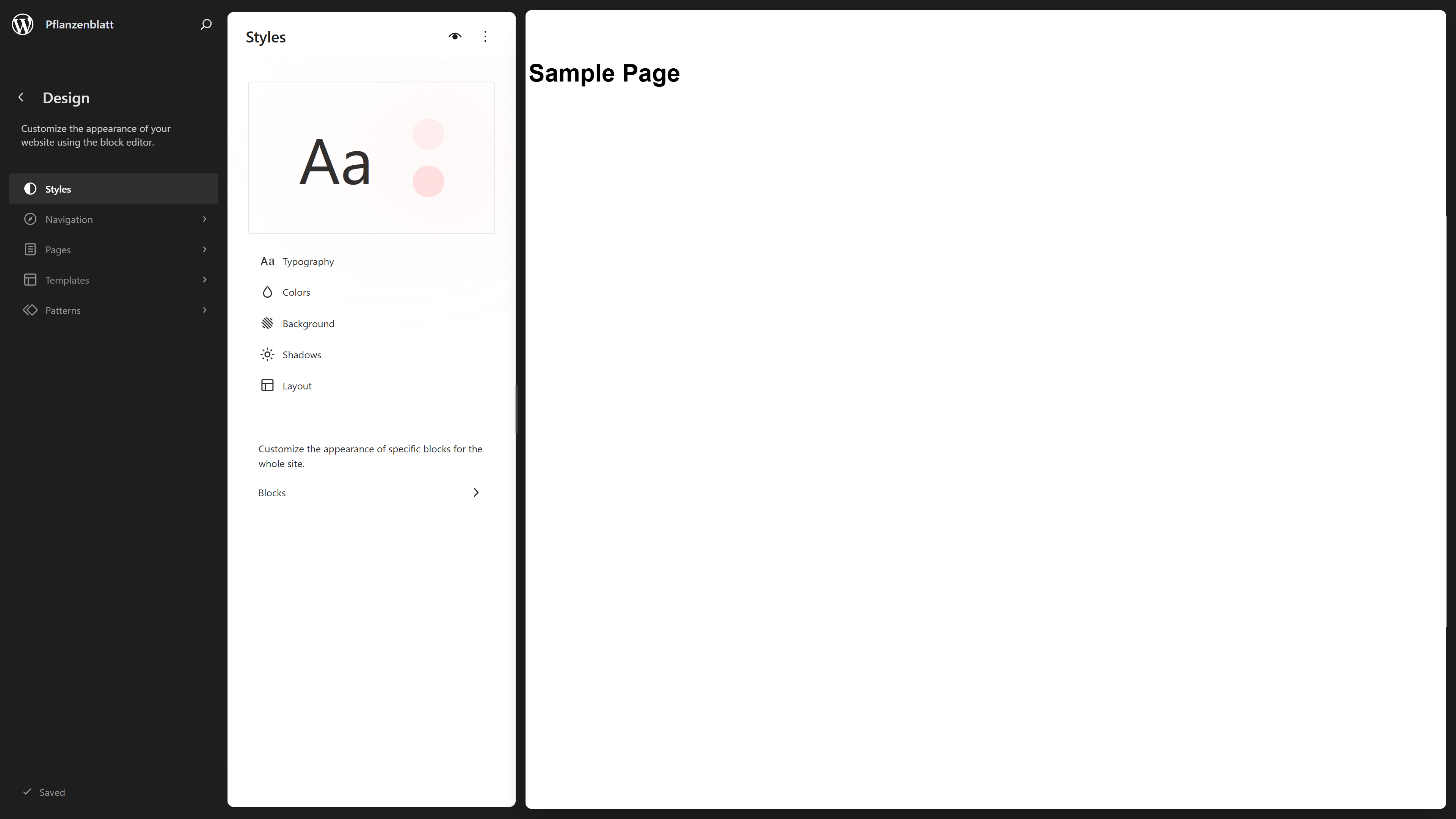
Everything you define in theme.json appears in the Global Styles panel in the Site Editor. Your color palette appears as swatches. Your font size scale appears in the typography controls. Your spacing scale appears in the spacing controls.
This is the critical connection between theme.json and the editing experience. The file is the source of truth. The Global Styles panel is the visual interface that reflects it.
When an editor changes something in Global Styles it writes user overrides on top of your theme.json defaults. Your defaults are always preserved — the editor's changes layer on top and can be reset at any time.
Template Parts
The templateParts section registers the template parts your theme uses — header, footer, sidebar, and so on:
"templateParts": [
  {
    "name": "header",
    "title": "Header",
    "area": "header"
  },
  {
    "name": "footer",
    "title": "Footer",
    "area": "footer"
  }
]
The area property tells WordPress what kind of template part this is. Valid values are header, footer, sidebar, and uncategorized. Template part files live in the parts/ directory of your theme.
Custom Templates
"customTemplates": [
  {
    "name": "blank",
    "title": "Blank",
    "postTypes": ["page", "post"]
  },
  {
    "name": "full-width",
    "title": "Full Width",
    "postTypes": ["page"]
  }
]
Custom templates registered here appear in the Template dropdown in the page/post editor. Template files live in the templates/ directory.
A Complete Minimal theme.json
Putting it all together, here is a solid starting point for a new FSE theme:
{
  "$schema": "https://schemas.wp.org/trunk/theme.json",
  "version": 3,
  "settings": {
    "appearanceTools": true,
    "useRootPaddingAwareAlignments": true,
    "layout": {
      "contentSize": "780px",
      "wideSize": "1200px"
    },
    "color": {
      "defaultPalette": false,
      "palette": [
        { "name": "Primary",    "slug": "primary",    "color": "#2563eb" },
        { "name": "Background", "slug": "background", "color": "#ffffff" },
        { "name": "Foreground", "slug": "foreground", "color": "#111827" },
        { "name": "Muted",      "slug": "muted",      "color": "#6b7280" }
      ]
    },
    "typography": {
      "fluid": true,
      "customFontSize": false,
      "fontSizes": [
        { "name": "Small",   "slug": "small",   "size": "0.875rem" },
        { "name": "Medium",  "slug": "medium",  "size": "1rem" },
        { "name": "Large",   "slug": "large",   "size": "1.25rem" },
        { "name": "XLarge",  "slug": "x-large", "size": "1.5rem" },
        { "name": "Display", "slug": "display", "size": "clamp(2rem, 5vw, 3.5rem)" }
      ]
    },
    "spacing": {
      "padding": true,
      "margin": true,
      "blockGap": true,
      "units": ["rem", "px", "%"],
      "spacingSizes": [
        { "name": "Small",  "slug": "sm", "size": "1rem" },
        { "name": "Medium", "slug": "md", "size": "2rem" },
        { "name": "Large",  "slug": "lg", "size": "4rem" }
      ]
    }
  },
  "styles": {
    "color": {
      "background": "var(--wp--preset--color--background)",
      "text": "var(--wp--preset--color--foreground)"
    },
    "typography": {
      "fontSize": "var(--wp--preset--font-size--medium)",
      "lineHeight": "1.6"
    },
    "spacing": {
      "blockGap": "var(--wp--preset--spacing--md)"
    },
    "elements": {
      "link": {
        "color": { "text": "var(--wp--preset--color--primary)" },
        "typography": { "textDecoration": "none" }
      }
    }
  },
  "templateParts": [
    { "name": "header", "title": "Header", "area": "header" },
    { "name": "footer", "title": "Footer", "area": "footer" }
  ]
}
What to Do Next
theme.json is the foundation of every FSE theme. Once you have the basics in place the natural next steps are:
Registering custom fonts using fontFamilies in settings. Setting up a custom spacing scale that matches your design system. Using blocks in styles to set sensible defaults for every core block. Exploring patterns to register reusable block patterns alongside your theme.
The WordPress schema at https://schemas.wp.org/trunk/theme.json is the authoritative reference for every available property — with the $schema line at the top of your file VS Code will autocomplete and validate everything as you type.
Building a custom FSE theme or Gutenberg blocks for your project? Get in touch.
Share this article