
A practical guide to making custom Gutenberg blocks WCAG 2.1 AA compliant. Covers semantic HTML, ARIA attributes, keyboard navigation, colour contrast and testing.
WCAG compliance is one of those things most WordPress developers know they should care about but never quite get around to implementing properly. It gets pushed to the end of the project, then forgotten at launch, then becomes a problem six months later when a client asks about it or a legal requirement lands on their desk.
This post is a practical guide to the specific things you need to do to make your custom Gutenberg blocks WCAG 2.1 AA compliant — the standard required by the EU Accessibility Act and the benchmark most organisations target.
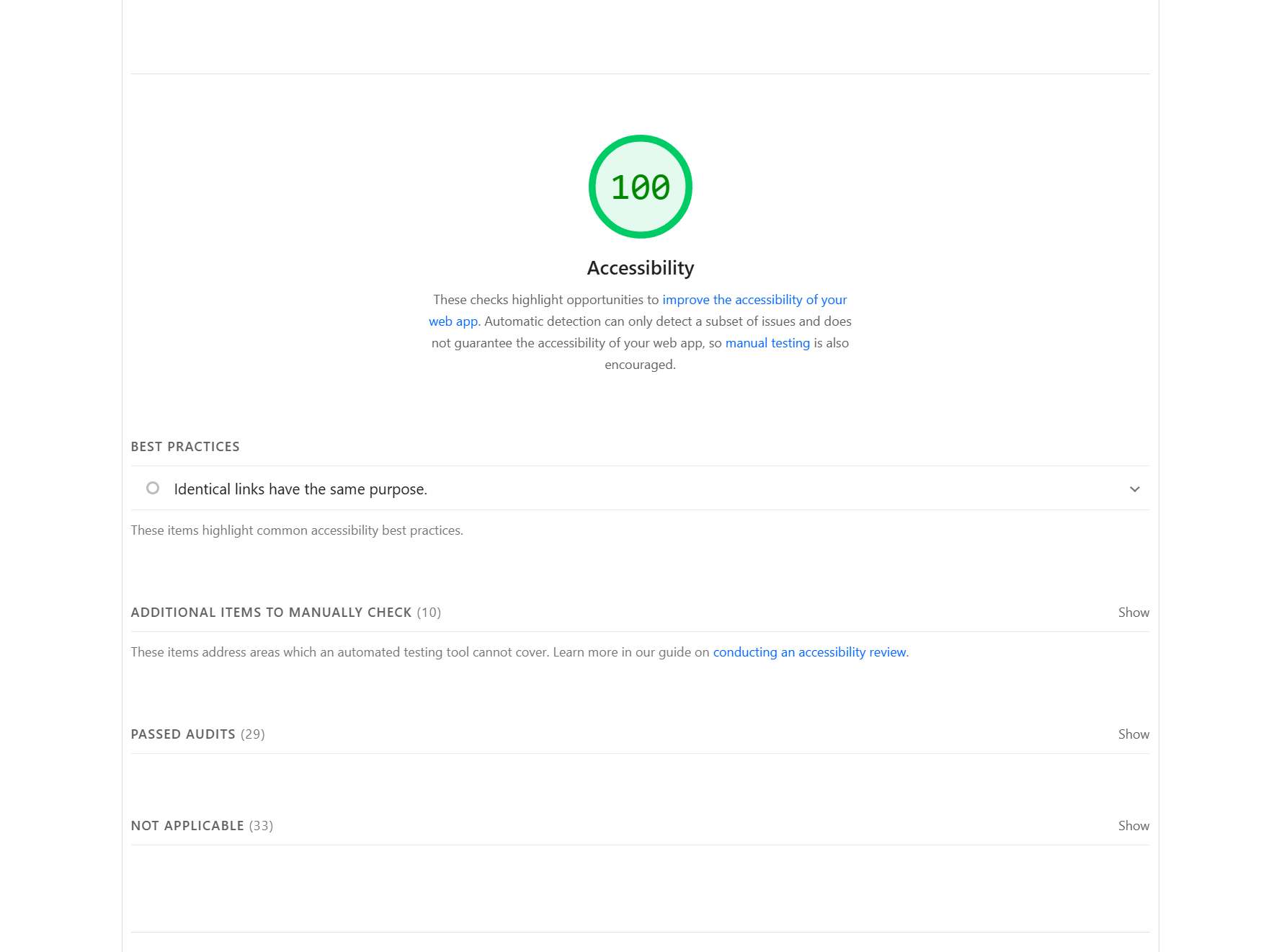
A score of 100 on the Lighthouse accessibility audit is achievable on every project. It is not a stretch goal — it is the baseline you should be hitting before any block leaves local development.
What WCAG 2.1 AA Actually Requires
WCAG stands for Web Content Accessibility Guidelines. Version 2.1 AA is the conformance level required by most accessibility legislation including the EU Accessibility Act, the UK Equality Act, and Section 508 in the United States.
At its core WCAG 2.1 AA is organised around four principles — content must be Perceivable, Operable, Understandable, and Robust. For Gutenberg block developers, these translate into a specific set of practical requirements that come up on almost every project.
1. Use Semantic HTML in Your save.js
The single most impactful thing you can do for WCAG compliance costs nothing and requires no ARIA. Use the correct HTML element for the job.
// Wrong
<div onClick={ handleClick }>Read more</div>

// Right
<button onClick={ handleClick }>Read more</button>

// Wrong
<div className="cta-link" href={ url }>Contact Us</div>

// Right
<a href={ url }>Contact Us</a>
Screen readers, keyboard navigation, and search engines all depend on semantic HTML to understand the structure and purpose of your content. A <button> is keyboard focusable, activatable with Enter and Space, and announced correctly by screen readers — for free, without a single line of ARIA. A <div> with an onClick gives you none of that.
Use <h1> through <h6> in a logical hierarchy. Use <nav> for navigation blocks. Use <main>, <header>, <footer>, and <section> to landmark your page structure. Use <ul> and <ol> for lists.
2. Handle Background Images with ARIA
Background images set via CSS have no native alt text field. This is one of the most common accessibility oversights in custom Gutenberg blocks because it is invisible to automated testing tools — the image renders fine visually but a screen reader user gets nothing.
If the background image is purely decorative, hide it from assistive technologies:
<div
  role="presentation"
  style={{ backgroundImage: `url(${ imageUrl })` }}
  className="wp-block-custom-banner"
>
  { /* block content */ }
</div>
If the background image carries meaning — a hero banner, a section that uses the image to establish context — expose it properly:
<div
  role="img"
  aria-label={ imageAlt }
  style={{ backgroundImage: `url(${ imageUrl })` }}
  className="wp-block-custom-banner"
>
  { /* block content */ }
</div>
Add imageAlt as a string attribute in your block.json so the editor can set it:
"imageAlt": {
  "type": "string",
  "default": ""
}
Then expose it in the sidebar via InspectorControls:
<TextControl
  label="Background image description"
  help="Describe the image for screen reader users"
  value={ imageAlt }
  onChange={ ( value ) => setAttributes( { imageAlt: value } ) }
/>
3. Add ARIA Labels to Landmark Sections
Every major section of a page should have an accessible name so screen reader users can navigate between them using landmarks. In your block's save.js, add aria-label to your section containers:
<section aria-label="Featured projects">
  { /* block content */ }
</section>
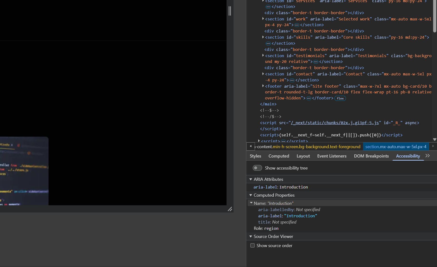
The DevTools Accessibility panel shows exactly what a screen reader sees — the computed name, role, and ARIA attributes for any element. Get into the habit of checking this during development.
If you have multiple sections using the same block — for example a "Features" block used three times on the same page — make the label editable via an attribute rather than hardcoding it:
<section aria-label={ sectionLabel || 'Content section' }>
  { /* block content */ }
</section>
4. Make All Interactive Elements Keyboard Accessible
Every interactive element in your block must be reachable and operable with a keyboard alone. Tab moves focus forward, Shift+Tab moves it backward, Enter activates links and buttons, Space activates buttons.
If you build custom interactive components — toggles, accordions, tabs, modals — you need to manage keyboard events explicitly:
<div
  role="button"
  tabIndex={ 0 }
  onClick={ handleToggle }
  onKeyDown={ ( e ) => {
    if ( e.key === 'Enter' || e.key === ' ' ) {
      e.preventDefault();
      handleToggle();
    }
  } }
>
  Toggle content
</div>
Better still — use a native <button> element and avoid the problem entirely. Native elements handle keyboard interaction automatically.
Focus indicators must always be visible. Never do this:
*:focus {
  outline: none;
}
This removes the visible focus ring from every element on the page and fails WCAG 2.1 criterion 2.4.7. Use :focus-visible to show a custom focus style only for keyboard users:
.wp-block-custom-cta a:focus-visible {
  outline: 2px solid currentColor;
  outline-offset: 3px;
  border-radius: 2px;
}
5. Colour Contrast
WCAG 2.1 AA requires a minimum contrast ratio of 4.5:1 for normal text and 3:1 for large text (18px bold or 24px regular) against its background.
The most common failures are:
- Light grey text on white backgrounds
- White text on semi-transparent image overlays
- Coloured text on coloured backgrounds where the hue difference looks sufficient but the luminance difference does not
Use the browser's DevTools colour picker — it shows the contrast ratio live as you adjust colours. Or use the free Colour Contrast Analyser tool from TPGi. Aim for ratios above the minimum to give yourself margin for different screen calibrations.
When building blocks that accept custom colours via PanelColorSettings, consider warning the editor when the chosen combination fails contrast requirements. The @wordpress/components library includes a ContrastChecker component for exactly this:
import { ContrastChecker, PanelColorSettings } from '@wordpress/block-editor';

<PanelColorSettings
  title="Colour settings"
  colorSettings={ [
    { value: textColor, onChange: setTextColor, label: 'Text colour' },
    { value: backgroundColor, onChange: setBackgroundColor, label: 'Background colour' },
  ] }
>
  <ContrastChecker
    textColor={ textColor }
    backgroundColor={ backgroundColor }
  />
</PanelColorSettings>
This shows a warning in the editor sidebar when contrast is insufficient — catching the problem before it reaches production.
6. Meaningful Link Text
Every link in your block must make sense when read out of context. Screen reader users often navigate by tabbing through links — they hear the link text without the surrounding content.
// Wrong — meaningless out of context
<a href={ url }>Click here</a>
<a href={ url }>Read more</a>

// Right — meaningful out of context
<a href={ url }>Read our guide to Gutenberg blocks</a>
<a href={ url }>View the Pflanzenblatt case study</a>
If your design requires short link text like "Read more", add visually hidden context for screen readers:
<a href={ url }>
  Read more
  <span className="screen-reader-text"> about Gutenberg block development</span>
</a>
With the corresponding CSS:
.screen-reader-text {
  position: absolute;
  width: 1px;
  height: 1px;
  padding: 0;
  margin: -1px;
  overflow: hidden;
  clip: rect(0, 0, 0, 0);
  white-space: nowrap;
  border: 0;
}
7. Use useBlockProps Correctly
useBlockProps in your edit.js and useBlockProps.save() in your save.js add the required WordPress block wrapper attributes — including accessibility-related attributes the block editor manages automatically. Always spread it on your outermost element:
// edit.js
const blockProps = useBlockProps();
return <div { ...blockProps }>{ /* content */ }</div>;

// save.js
return <div { ...useBlockProps.save() }>{ /* content */ }</div>;
Skipping useBlockProps breaks block selection, editor styling, and several accessibility features the block editor handles behind the scenes.
Testing Before You Ship
Run these three checks on every block before it leaves local development:
Lighthouse — DevTools → Lighthouse → Accessibility only → Analyse page load. A score below 100 means something is failing. Fix it before moving on.
Keyboard test — Unplug the mouse. Navigate through the block using Tab, Shift+Tab, Enter, and Space. If you get stuck or lose the focus indicator at any point, something needs fixing.
axe DevTools — Free Chrome extension. Catches issues Lighthouse misses, particularly around ARIA usage and colour contrast in specific contexts.
These three checks together take under five minutes per block and catch the vast majority of WCAG 2.1 AA failures before they reach production.
The Bottom Line
WCAG compliance in Gutenberg blocks is not complicated once it is part of your workflow. Semantic HTML gets you most of the way there. ARIA fills the gaps semantic HTML cannot cover. Keyboard testing and a Lighthouse audit before handoff catches what you missed.
The EU Accessibility Act means WCAG 2.1 AA is increasingly a legal requirement for your clients' websites. Building compliant blocks from the start is faster, cheaper, and less stressful than retrofitting accessibility after launch.
Need custom Gutenberg blocks built to WCAG 2.1 AA standards? Get in touch.
Share this article