
A step-by-step guide to building your first custom Gutenberg block using @wordpress/create-block, JSX, and modern block development practices.
Custom Gutenberg blocks are one of the most valuable skills a WordPress developer can have right now. Almost every serious WordPress project eventually needs something the core block library doesn't provide — and knowing how to build it properly puts you in a different category from most WordPress developers.
This tutorial walks through building a simple CTA block from scratch using @wordpress/create-block. By the end you will have a working block with editable heading, description, and button — registered and usable inside the Gutenberg editor.
What You Need Before Starting
- Node.js installed (version 20 or higher)
- A local WordPress environment (LocalWP, DevKinsta, or similar)
- Basic familiarity with React and JSX
That is all. You do not need to set up a build process manually — @wordpress/create-block handles everything.
Step 1 — Scaffold the Block Plugin
Navigate to your WordPress plugins directory and run:
npx @wordpress/create-block cta-block
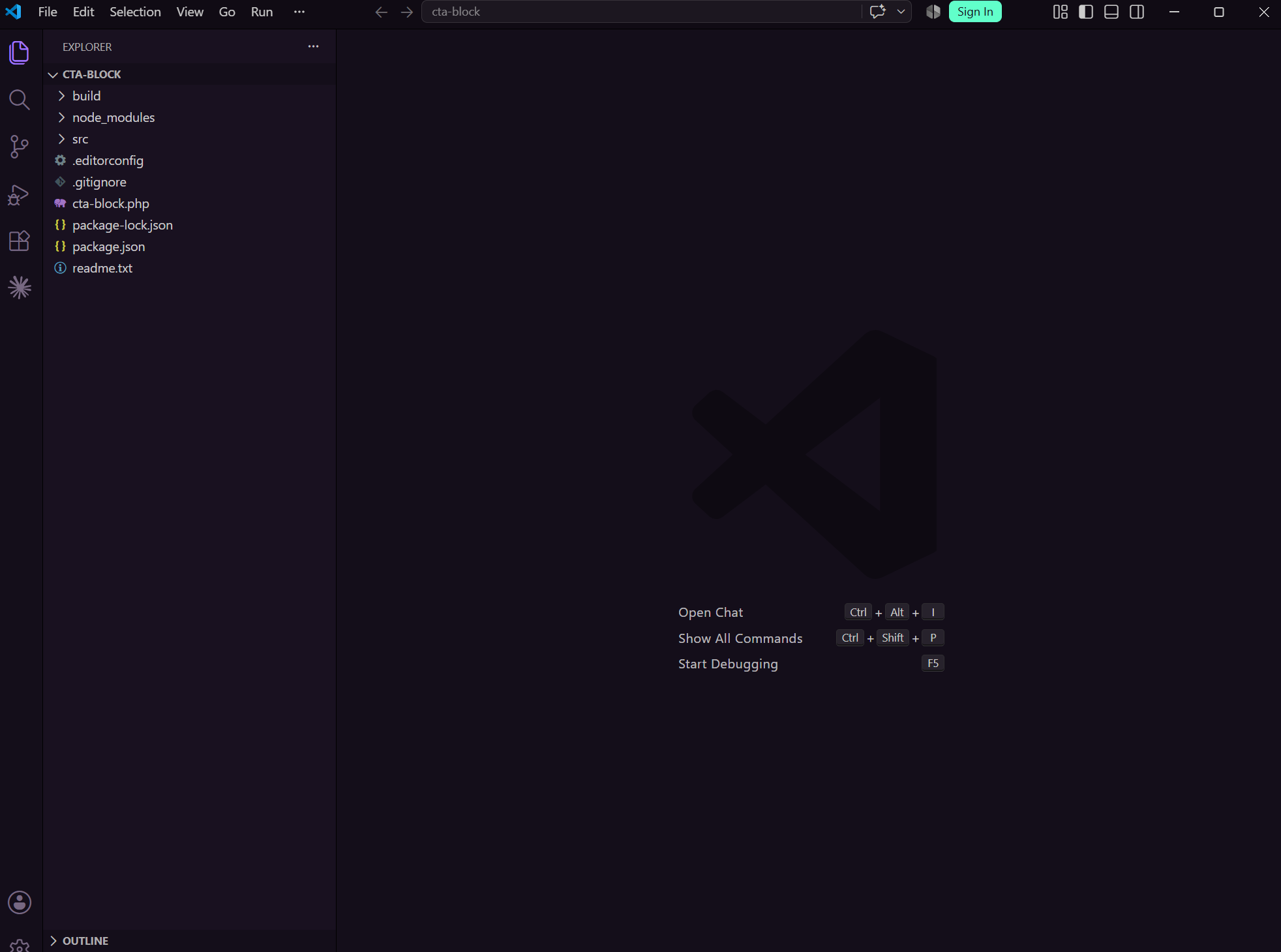
This generates a complete block plugin with everything you need:
cta-block/
├── src/
│   ├── block.json
│   ├── edit.js
│   ├── save.js
│   ├── index.js
│   ├── editor.scss
│   └── style.scss
├── cta-block.php
└── package.json
Navigate into the plugin folder and start the development build:
cd cta-block
npm start
Then activate the plugin in your WordPress admin under Plugins. Your block is now registered and available in the editor — though it doesn't do much yet.
Step 2 — Define Your Block Attributes in block.json
block.json is the heart of your block. It defines the block's name, title, category, and most importantly its attributes — the data your block stores.
Open src/block.json and replace the attributes section with:
{
  "$schema": "https://schemas.wp.org/trunk/block.json",
  "apiVersion": 3,
  "name": "create-block/cta-block",
  "version": "0.1.0",
  "title": "CTA Block",
  "category": "design",
  "icon": "megaphone",
  "description": "A simple call to action block with heading, description and button.",
  "supports": {
    "html": false
  },
  "attributes": {
    "heading": {
      "type": "string",
      "default": "Ready to get started?"
    },
    "description": {
      "type": "string",
      "default": "Get in touch and lets build something great together."
    },
    "buttonText": {
      "type": "string",
      "default": "Contact Us"
    },
    "buttonUrl": {
      "type": "string",
      "default": "#"
    }
  },
  "editorScript": "file:./index.js",
  "style": "file:./style-index.css",
  "editorStyle": "file:./index.css"
}
Attributes are how Gutenberg stores block data in the database. Every piece of editable content in your block needs an attribute.
Step 3 — Build the Editor View in edit.js
The edit.js file controls what the block looks like and how it behaves inside the Gutenberg editor. This is where you use WordPress block editor components to make fields editable.
Replace the contents of src/edit.js with:
import { useBlockProps, RichText, InspectorControls } from '@wordpress/block-editor';
import { PanelBody, TextControl } from '@wordpress/components';

export default function Edit( { attributes, setAttributes } ) {
  const { heading, description, buttonText, buttonUrl } = attributes;
  const blockProps = useBlockProps();

  return (
    <>
      <InspectorControls>
        <PanelBody title="Button Settings">
          <TextControl
            label="Button URL"
            value={ buttonUrl }
            onChange={ ( value ) => setAttributes( { buttonUrl: value } ) }
          />
        </PanelBody>
      </InspectorControls>

      <div { ...blockProps }>
        <RichText
          tagName="h2"
          value={ heading }
          onChange={ ( value ) => setAttributes( { heading: value } ) }
          placeholder="Enter heading..."
        />
        <RichText
          tagName="p"
          value={ description }
          onChange={ ( value ) => setAttributes( { description: value } ) }
          placeholder="Enter description..."
        />
        <RichText
          tagName="span"
          value={ buttonText }
          onChange={ ( value ) => setAttributes( { buttonText: value } ) }
          placeholder="Button text..."
        />
      </div>
    </>
  );
}
A few things worth noting here:
useBlockProps adds the required Gutenberg block wrapper attributes to your container div. Always use it — it handles accessibility, block selection, and editor styling.
RichText makes any text field editable directly in the editor. The onChange handler updates the attribute via setAttributes every time the content changes.
InspectorControls renders content in the right sidebar panel. It is the right place for settings that are not inline editable — like the button URL.
Step 4 — Build the Frontend Output in save.js
The save.js file controls the HTML that gets saved to the database and rendered on the frontend. Unlike edit.js it is a pure function — no hooks, no state, just attributes in and HTML out.
Replace the contents of src/save.js with:
import { useBlockProps, RichText } from '@wordpress/block-editor';

export default function save( { attributes } ) {
  const { heading, description, buttonText, buttonUrl } = attributes;

  return (
    <div { ...useBlockProps.save() }>
      <RichText.Content tagName="h2" value={ heading } />
      <RichText.Content tagName="p" value={ description } />
      <a href={ buttonUrl } className="cta-button">
        <RichText.Content tagName="span" value={ buttonText } />
      </a>
    </div>
  );
}
Notice RichText.Content instead of RichText — the Content version renders the saved value as static HTML rather than an editable field. And useBlockProps.save() instead of useBlockProps() — the save version outputs the correct wrapper attributes for the frontend.
Step 5 — Style the Block
Open src/style.scss for styles that apply both in the editor and on the frontend:
.wp-block-create-block-cta-block {
  padding: 3rem 2rem;
  text-align: center;
  background-color: #f9f9f9;
  border-radius: 8px;

  h2 {
    font-size: 2rem;
    margin-bottom: 1rem;
  }

  p {
    font-size: 1.1rem;
    margin-bottom: 2rem;
    color: #555;
  }

  .cta-button {
    display: inline-block;
    padding: 0.75rem 2rem;
    background-color: #0073aa;
    color: #fff;
    border-radius: 4px;
    text-decoration: none;
    font-weight: 600;

    &:hover {
      background-color: #005177;
    }
  }
}
Step 6 — Test It in the Editor
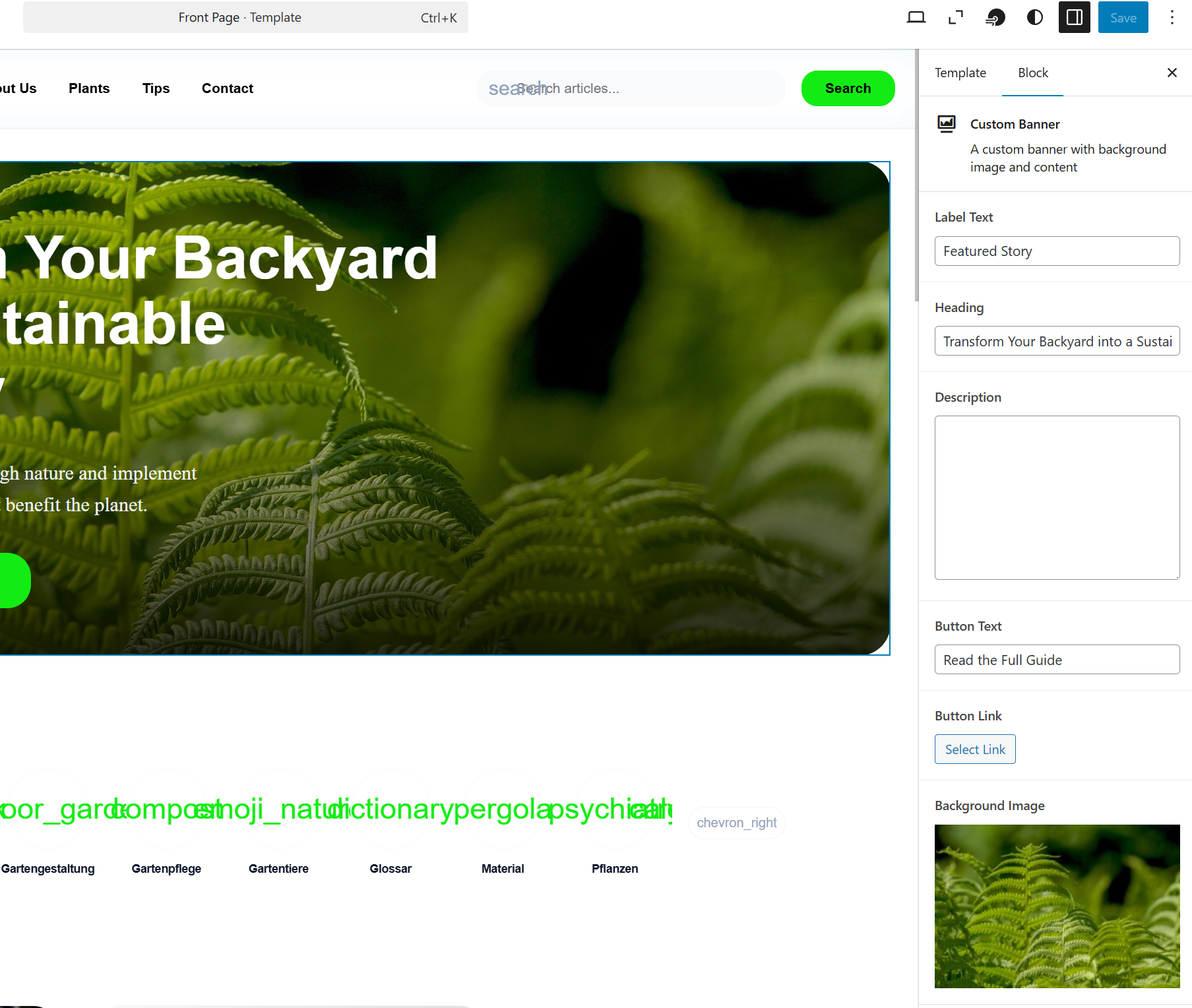
Open a page or post in your WordPress admin, search for "CTA Block" in the block inserter, and add it. You should see your heading, description, and button text all editable inline. Click the button URL field in the right sidebar to set the link.
If everything looks right, run the production build:
npm run build
This compiles and minifies your block assets ready for deployment.
What to Do Next
This is a minimal block — it works, but a production block would go further:
- Add color controls using
PanelColorSettings - Add alignment support via the
supportskey inblock.json - Add spacing controls via
useBlockProps - Handle
aria-labelon the button for accessibility
The fundamentals you have learned here — attributes, edit.js, save.js, RichText, InspectorControls — apply to every block you will ever build. The complexity scales from here but the structure stays the same.
Need a custom Gutenberg block built properly for your project? Get in touch.
Share this article